|
Graphical exploration for
quantitative/qualitative data acts as the initial yet essential
step in modern statistical data analysis. All conventional
graphical tools have their own limits: Scatterplot Matrix (SM) is
useful for visualizing about only twenty variables; Box-Plot (BP)
does not provide interactions between variables;
Parallel-Coordinate-Plot (PCP) requires extensive conditioning for
extracting overall information. Dimension reduction tools such as
Principal Component Analysis (PCA) and MultiDimensional Scaling
(MDS) also lose effectiveness when it comes to visual exploration
of information structure embedded in very high dimensional data
sets.
Matrix visualization (MV, Chen (2002); Chen et
al. (2004)) on the other hand can
simultaneously explore the associations of up to thousands of
subjects, variables, and their interactions, without first
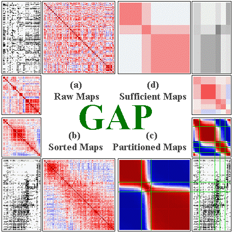
reducing dimension. MV permutes the rows and columns of the raw
data matrix by suitable seriation (reordering) algorithms,
together with the corresponding proximity matrices. The permuted
raw data matrix and two proximity matrices are then displayed as
matrix maps through suitable color spectra, and the
subject-clusters, variable-groups, and interactions embedded in
the data set can be visually extracted. For binary, ordinal, and
nominal data types, SM, BP, and PCP basically can not provide much
visual information while MV still gives us comprehensive
information about individual profiles for subjects and variables
together with the interaction patterns of each subject-cluster on
every variable-group.
|
0. General framework of generalized
association plots (GAP) for MV
 |
|
In this lecture I will first briefly
introduce the technical background of MV for continuous, binary,
and nominal data types using the Generalized Association Plots
(GAP) developed by our laboratory of information visualization.
Real applications to scientific problems from biomedical
experiments, psychometric studies, and social surveys will then be
presented followed by ongoing developments and potential future
directions for MV research. Related information and software
(currently for continuous and binary data only; we hope to release
the nominal version of GAP during the Kunming meeting) can be
obtained from
http://gap.stat.sinica.edu.tw/. Potential participants are
encouraged to download the Java version of GAP with user manual
before attending the training course.
|